UX Writing - Lingual App
Content design for a language learning app.
Scroll ↓
As a student with UX Writing Hub’s Academy, I designed content for five scenarios in the Lingual app.
Challenge
Craft all copy according to the guidelines in Lingual’s content style guide, shown below for your reference.
Guidelines
Lingual’s style guide defines its brand voice as:
Magical: Anything is possible inside the world of Lingual
Encouraging and positive: We're all about rooting for our learners and helping them make progress
Playful: We put the fun in language learning
Solution
Using the style guidelines, develop copy that is magical, encouraging, positive, and playful while also using empathy to ensure the tone matches the mood and expectations of the user.
Rationale
See my rationale and process behind these designs in this shared PDF: Lingual App.
How I helped
Researched four language apps (Duolingo, Babbel, RosettaStone, and Mondly) and made notes of common themes for inspiration i.e. layout, messaging, and design.
Kept a record of all ideas in my copy docs file and provided my reasoning for the final versions.
Collaborated with my senior UX writing mentor to discuss iterations and receive feedback.
Initially split test the idea on our second best performing silo/landing page for “receipt template”. Later used Google Optimize to split test the main “invoice template” landing page.
Process
Context gathering and language app research —> Define language and words —> Ideate —> Create mockups —> Publish —> Ask questions to and receive feedback from my mentor —> Make minor adjustments to final versions
Scenario 1
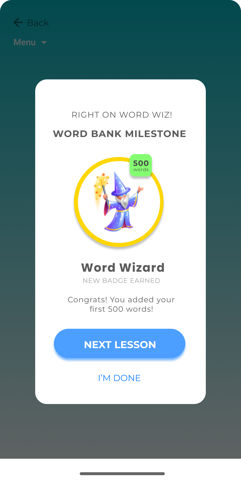
In Lingual, users earn badges that they display on their user profiles.
The user earned the Word Wizard badge for adding their first 500 words to their word bank. This is shown after the user completes a lesson.
Scenario 2
The user tries to exit in the middle of a learning session. All session data will be lost if they exit.
Scenario 3
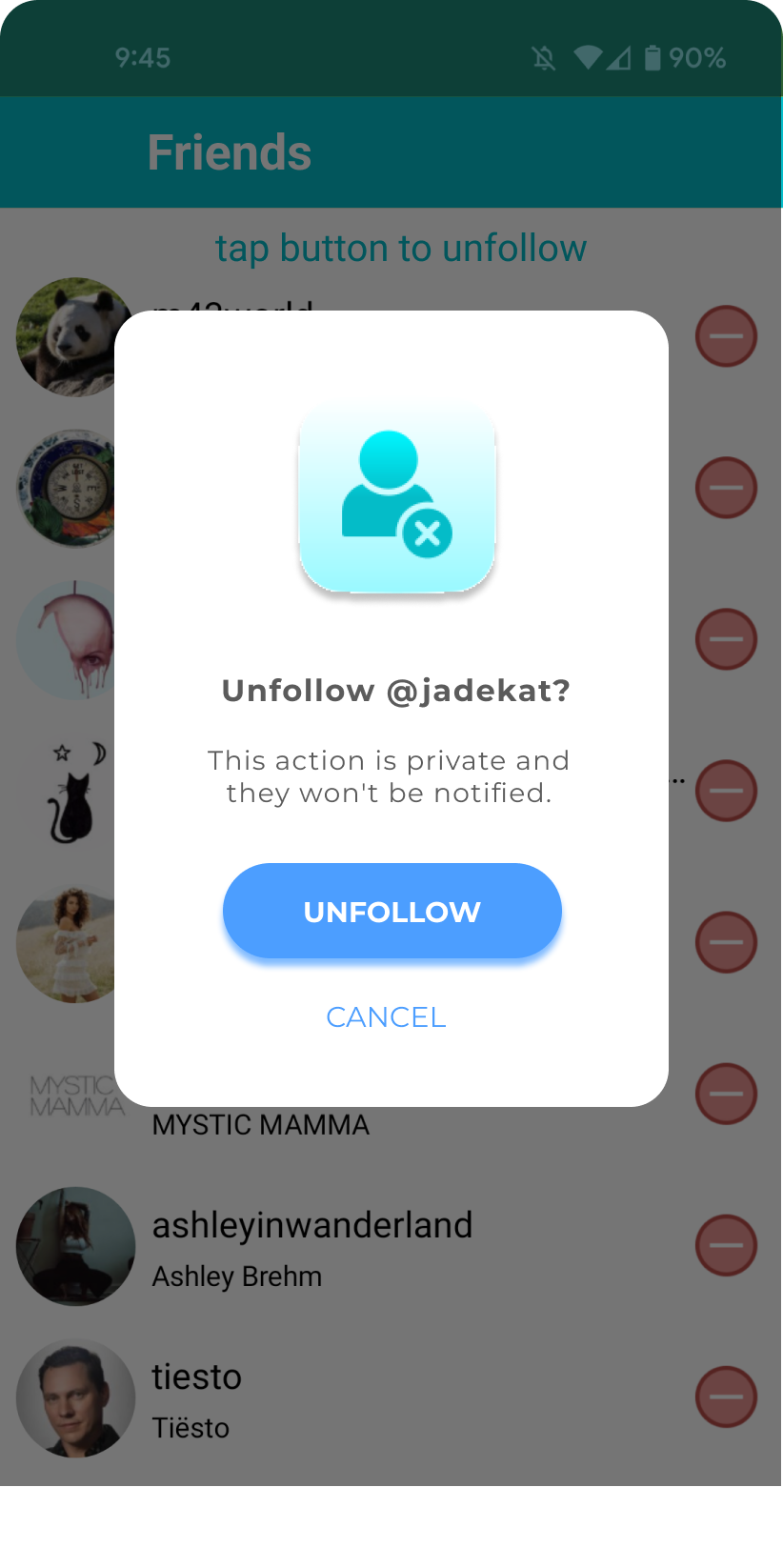
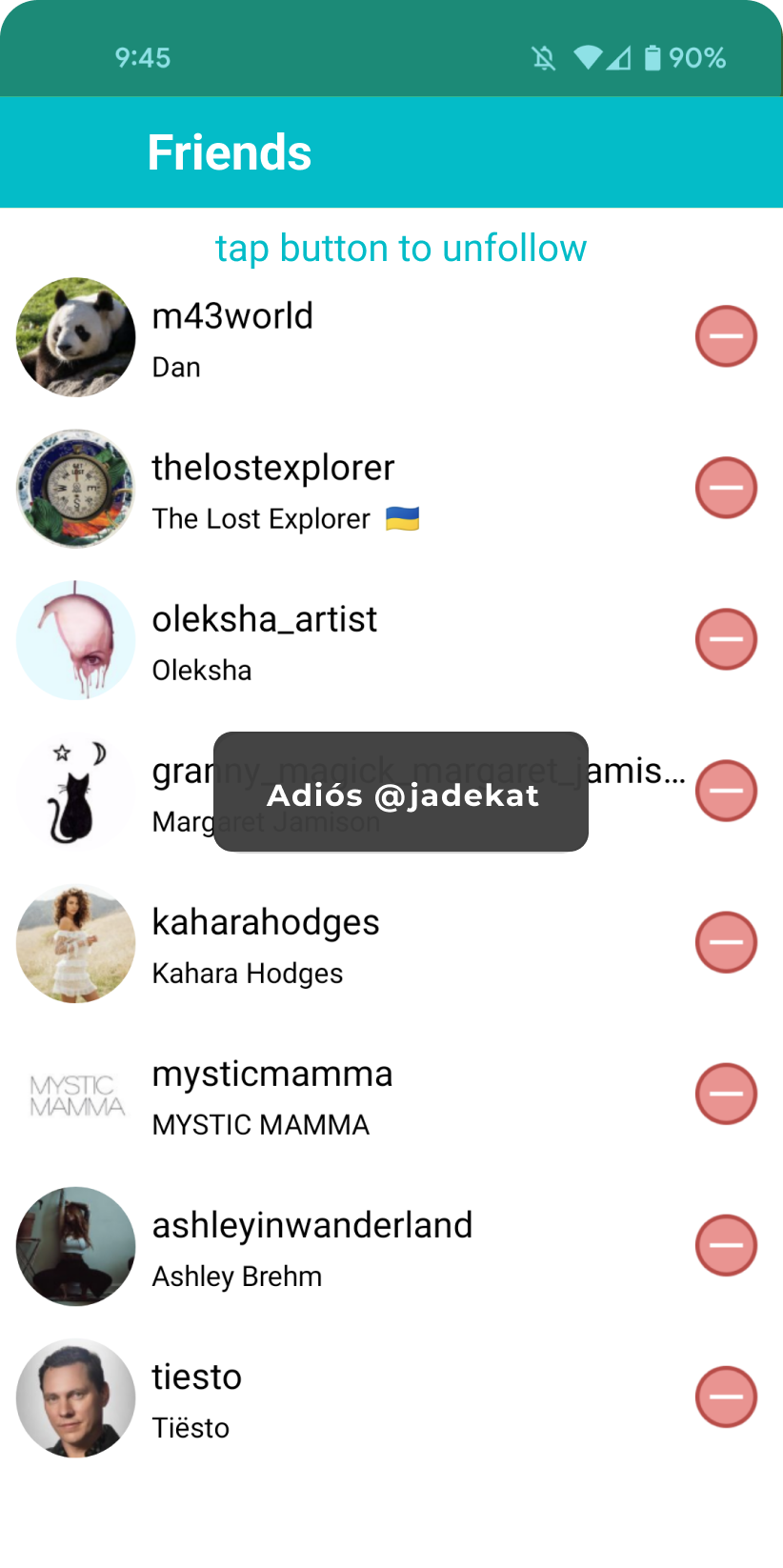
The user chose to unfollow a fellow learner.
I later decided the first pop-up is good for the first time a user unfollows someone. It’s not necessary for them to see this message every time they unfollow someone.
Scenario 4
The next lesson can’t load because the user lost internet connection.
Scenario 5
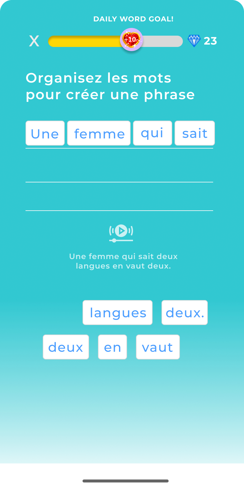
Users have daily word bank goals based on their daily target of new words ex: a user can set their goal as adding 10 new words per day to their word bank.
During a lesson, a user has just met their daily word bank goal and earned a reward: 10 Ling-gems, for use at the Ling-Shop.
You decide where in the flow to present this information and how. During the lesson? After a lesson is complete? Only when the user visits their profile? Explain where you chose to put this message and why.


