Hi! This real industry project is currently in progress. See this project brief and the Miro board below for a quick snapshot. 😊
UX Writing - Website Refresh
User journey redesign, website copy, and more for a cycling company operating on two verticals.
Scroll ↓
A perk of being in UX Writing Hub is getting to work on a real industry project. Our team of six is applying our UX writing skills to redesign Eat Sleep Cycle’s tour user flow and copy for their new website.
Overview
Eat Sleep Cycle is cycling company that operates on two verticals:
an e-commerce store selling bicycles and accessories
organizes cycling events/tours in Spain and western Europe
See the full project brief here: Eat Sleep Cycle
Eat Sleep Cycle: True Believers in Cycling.
Scope
I’m tasked to perform research and design copy for Eat Sleep Cycle’s new website. The goal is to analyze and improve the current user journey and “tour checkout” user flow to increase conversions. If there is time we will also work to design and implement a newsletter sequence.
My role: UX writer on a team of 6
Stakeholders: Eat Sleep Cycle’s owners + Marketing Director; teammates
Deliverables:
UX research (stakeholder interview questions, user personas)
content style guide
newsletter sequence
new user flow for “tour checkout”
new copy for entire website
Timeline: 6 weeks
Tools used: Figma, Miro, Notion, Google Docs
Problem
———
Hypothesis
———
Challenges
———
Process
Perform audit of mockup -> Research fitness apps and onboarding best practices -> Conversation mining -> Determine the product’s onboarding user flow -> Draft ideas in copy docs -> Develop voice and tone -> Select final copy including rationale -> Design mockups -> Submit deliverables to mentor
Brand Personality
A trainer who’s also a friend. Someone who motivates you to go the extra mile and finish strong. A companion who believes in your capabilities and wants you to believe in yourself and realize how strong you really are. They are your personal cheerleader and advocate when you need encouragement. Someone the user trusts and turns to when they need help making their fitness dreams and goals a reality.
Product Voice & Tone
Encouraging, engaging, friendly, enthusiastic, able to connect with all types of people, knowledgeable, present, and there for you on your fitness journey.
Approach
After product research and conversation mining, I drew an empathy map to gauge user feelings and related insights to highlight their desires and pain points to help improve the onboarding messaging by being relevant, engaging, and timely.
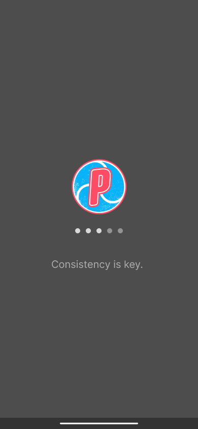
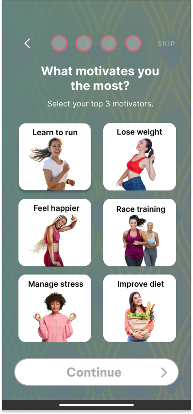
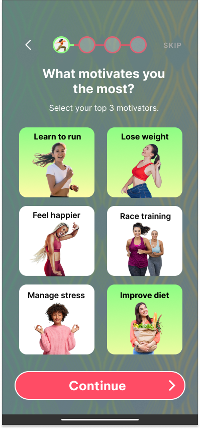
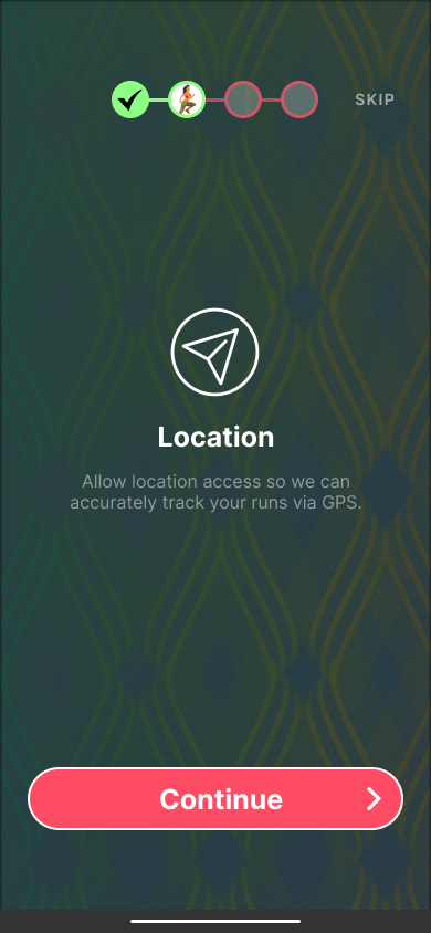
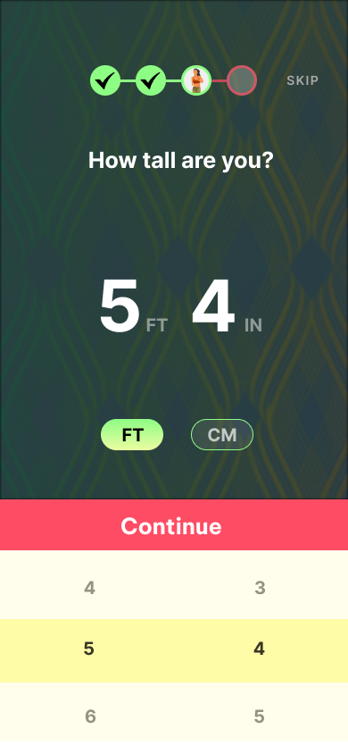
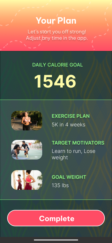
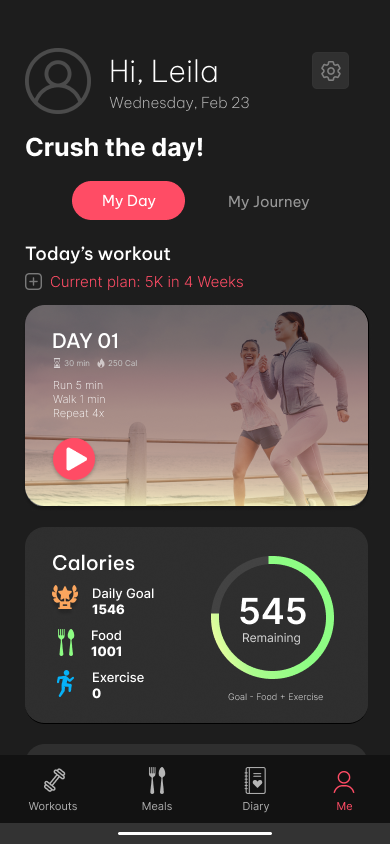
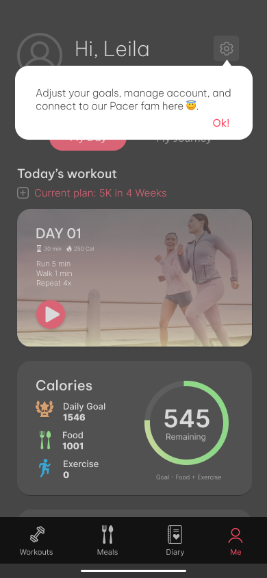
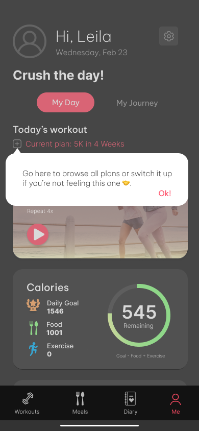
I redesigned the entire onboarding flow in an approachable and friendly tone that creates a sense of community and prioritizes user engagement by using progressive onboarding techniques that display important and relevant information necessary for both the user and the company.
UX Copy: Onboarding Redesign
My Challenges
For this project, I played the part of two personalities:
A trainer/fitness coach who motivates and helps clients achieve their fitness goals and recommends getting active at least 30 mins a day and improving eating habits to fully realize their best self and feel happier. While it may be hard in the beginning, it will be worth it in the end.
Pacer users and being cognizant of the various fitness levels and backgrounds they may come from. For the purpose of this scenario, I went with a “new to fitness/beginner” user. However, if I were to write the entire flow for all 3 fitness levels, I would need to modify the copy for “intermediate” and “advanced” users to ensure relevancy.
Conversation and content mining was quite important because I had to determine language and content design patterns across fitness apps and how to display information to keep the engagement factor high for the user.
Determining goal setting and amount of onboarding
Content Testing
As this was a student project, I sent the final versions to my mentor, UX colleagues, and friends for testing and feedback. Multiple respondents said they loved the welcoming feel and sense of community of the welcome screen. Others said the information architecture and layout were engaging and encouraged them to complete the next step as they weren’t bogged down with information overload.
Results
The deliverables were submitted within the given timeline and met the objectives outlined in the brief.
If this were with an actual company and within my capacity, I would measure performance using the following metrics:
Onboarding completion & drop-off rates
Retention rate
Engagement rate
Number of onboarding support tickets per day/user feedback
Feature adoption rate
Activation rate


