Invoice Home
Desktop UX writing for a billing and invoicing SaaS product.
Scroll ↓
Invoice Home wanted to rethink a few sections of the desktop app and needed content to help users better understand the app and perform certain actions.
Update the “Account Removal” page
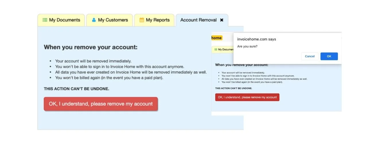
Users found finding how to delete an account difficult and didn’t understand that their account could not be recovered or restored once deleted. Additionally, the Support team reported receiving a high volume of user requests asking to restore deleted accounts. However, the company would no longer restore deleted accounts for security purposes, so we needed to convey to users that deleting an account is final.
Before
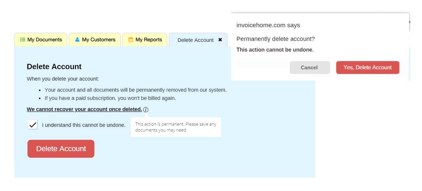
After
Challenge
Help users easily find out how to delete their account and better understand that deleting their account is a permanent action.
Solution
Use clear language to describe how to delete an account and convey that an account can’t be recovered.
How I helped
Changed action from "Account Removal" to "Delete Account" because it's clearer
Wrote new content for the “Delete Account” page, the floating infobox, and the browser pop-up window
Added extra friction by including a checkbox to slow the user down and get them to confirm they understand the action
CTAs on buttons match headlines to provide further clarity
Created mockup with the lead designer who created the assets and discussed with developers and the CTO
Results
Reduced the number of user requests asking to restore or recover a deleted account
Approved by the CTO and marketing team; implemented
My Role
lead writer
Add Email Verification for Users
New users weren't asked to verify their email addresses which resulted in the accidental creation of many double accounts and the purposeful creation of fake accounts which sometimes resulted in fraud. The company also had a high email bounce rate and the company wanted to improve its sender reputation.
Before
After
Challenge
The CTO wanted to shorten and revise the original placeholder text.
Solution
Describe the email verification process for users in clear language.
How I helped
Shortened the first two sections of the text to make it more concise
Wrote the floating pop-up text that appears when the user hovers over or taps on the exclamation icon
Discussed with the CTO and marketing team
Wrote the accompanying verification email that users receive
Results
Reduced the number of fake accounts and accounts with typos in the email address
Reduced the number of promotional emails sent to invalid or fake email addresses
Approved by the CTO and marketing team and was implemented
My Role
lead writer


