UX Writing
Sqaud App
UX writing for a creator & influencer marketing platform.
Scroll ↓
Squad App was redesigning its platform and wanted to refresh all of its UX/UI content.
Brand Info
SqaudApp is a marketing platform that connects advertisers with creators. Using its large database, brands can team up with creators that resonate with their target audience for collaborative and impactful campaigns.
Scope
While the brand architecture and personality existed, SquadApp wanted a UX writer to conduct an audit, write new UX copy for all relevant interfaces, and define more of a brand voice that matched their brand personality.
My role: UX Writer
Stakeholders: SquadApp product manager & design team
Deliverables: 11 projects
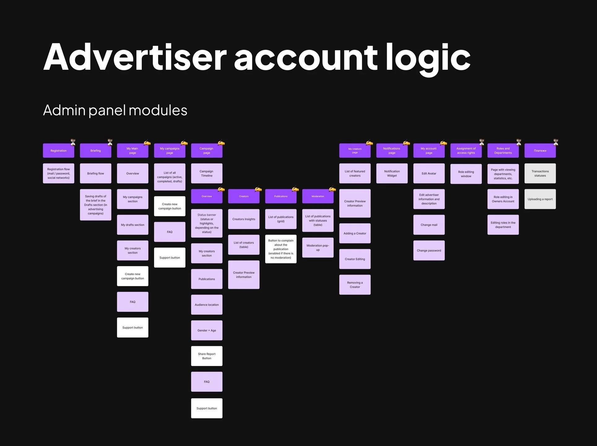
Advertiser account: Main ads campaign flow
Creator account
Tracking flow
Campaign briefs flow
Random screens
Advertiser registration
Referral system
Notifications, chatbot, and transactional email flows
Tracking notifications
FAQs
Creator Media Kit
Timeline: 09/2023 - 08/2024
Tools used: Figma, FigJam, Google Sheets, Slack
Empty State
Main Ads
Dashboard
Before
1st step/screen in the “Main Ads Campaign Flow”
Context
SquadApp updated its brand architecture and wanted to add more actionable content to its new user dashboard and the empty state of the “My Campaigns” section. I also needed to consider how this new content would balance and blend with the new design elements.
Challenge
The previous dashboard, while minimalist and functional, provided limited information and could’ve been more welcoming and encouraging to inspire action. The "Overview" section could also benefit from clearer naming conventions, and some language used in the Support card was inconsistent with SquadApp's more informal brand voice.
After
Solution
Working with SquadApp's UX design leads, we enhanced the dashboard's design by incorporating branded elements and developing engaging copy.
The previous empty state turned into a welcoming, informative, and inspiring space for new advertiser users, providing a clear value proposition and key steps to inspire action to create their 1st campaign.
Key UX/UI Copy Improvements
Replaced a generic "Time to start your first campaign" with a compelling headline that highlighted the platform's unique value: "Tap into a network of over 100,000 creators ready to level up your next campaign."
Introduced clear, actionable steps to give users a sense of the campaign process: "Plan your campaign," "Set your budget," and "Track your results."
Made the Support card subheader less formal to match Squad App voice e.g. “we’ll respond to your inquiry” -> “we’ll get you sorted ASAP”.
Refined the “Overview” section’s cards for clarity: “Total views”-> “Total campaign views” and “Total Publications” -> "Total campaigns posts”.
Main Ads Campaign Flow— Full
Results
User testing showed a clear preference for this new dashboard. Most notably, users reported feeling more welcome and appreciated the additional information about the campaign process.
Regarding business goals, I helped develop and restructure several user flows for the desktop and mobile apps. I also helped Squad App refine its brand voice and preference for professional, yet less formal, American English in preparation for its new rebranding and relaunch.


