UX Writing: User Journey Redesign
Redesign an onboarding flow for a goal-tracking exercise app.
Scroll ↓
As a student with UX Writing Hub’s Academy, I was tasked to improve and redesign the proposed new user onboarding flow.
Overview
Pacer is a goal-tracking exercise app that lets users set goals, track their progress, rate their workouts, and more.
See the full project brief and copy rationale here: Pacer Copy Docs
Scope
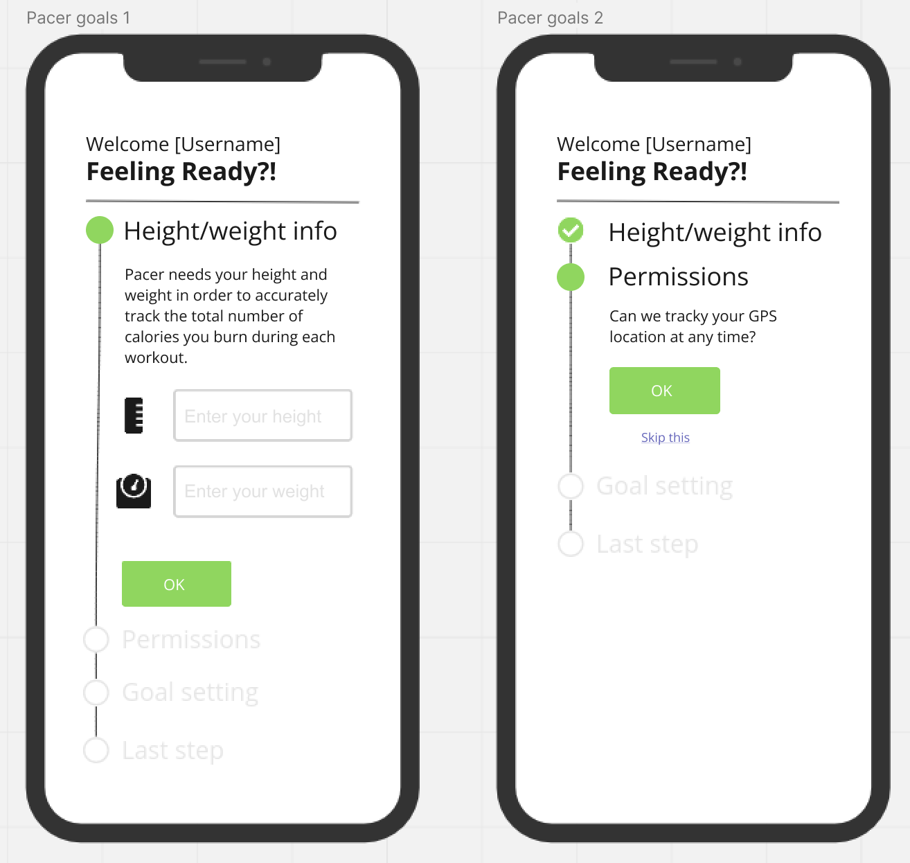
In this scenario, I was tasked to analyze the proposed journey (Figure 1) and think of ways to make it easier to use and understand. Then, create new onboarding screens for the mobile app.
My role: UX Writer
Stakeholders: UX writing mentor, UX Writing Hub, Pacer designer (fictional)
Deliverables: copy docs, revised user flow + product screens
Timeline: 7 days
Tools used: Figma, Google Sheets, Google Docs
Content Audit
Figure 1: proposed onboarding flow
Challenges
For a welcome screen, it’s a lot to process and contributes to a higher cognitive load that could overwhelm the user.
The header is not compelling and seems uncertain or anxious. “Feeling ready?!” about what? Also, the headline is missing a benefit e.g. why should a user continue entering their details? What’s in it for them?
I do like the progressive disclosure used to visualize progress and set expectations. Yet, it could be broken up into different screens to be easier for the user.
Screen 1: “Height/weight info” body is wordy.
Screen 2: the body under “Permission” says, “can we tracky your GPS location”. Not sure if “tracky” is a typo or being playful with words. Best to fix it to “track” to be clear.
Why is “Skip this” only available on the second screen?
Hypothesis
Pacer would increase new user sign-ups and engagements by making the copy more compelling, simplifying the onboarding flow, and adding elements of gamification. Focus on communicating value and reducing perceived friction and cognitive load.
UX Research
To test my hypothesis, I performed the following qualitative user research.
Conversation and content mining
language and content design patterns across fitness apps.
how to organize information to keep the engagement factor high.
goal setting and onboarding best practices.
User persona to target their challenges, pain points, motivations, and goals.
Created a quick user journey map to empathize with the user and visualize the flow.
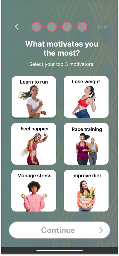
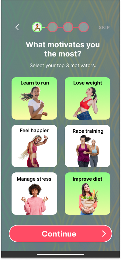
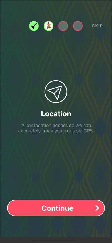
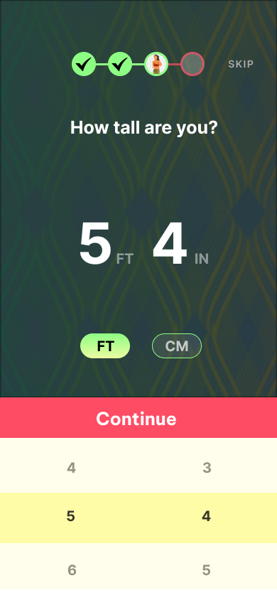
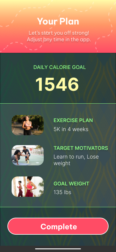
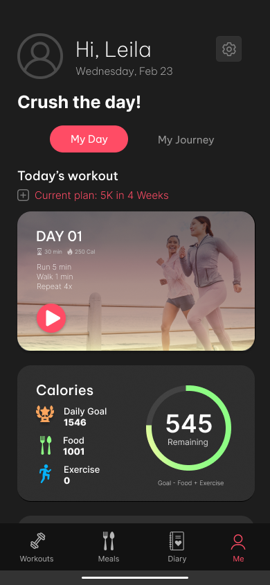
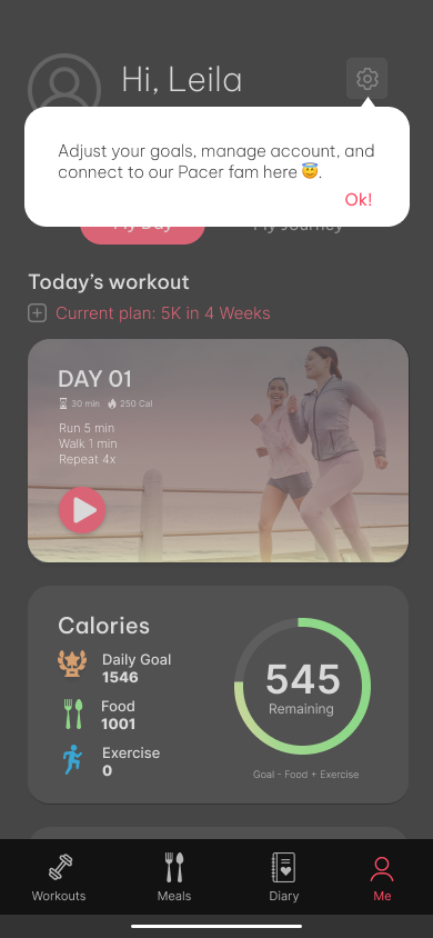
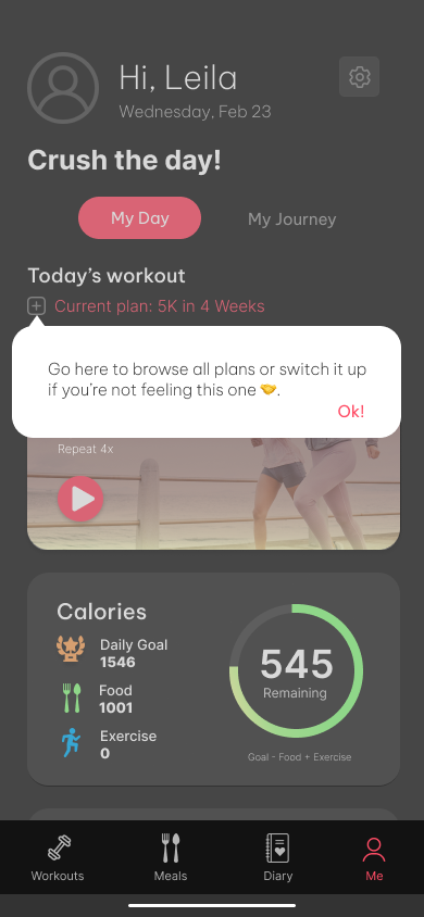
Pacer: Revised Onboarding Flow









My Challenges
For this project, I played the part of two personalities:
A trainer/fitness coach who motivates and helps clients achieve their fitness goals and recommends getting active at least 30 mins a day and improving eating habits to fully realize their best self and feel happier. While it may be hard in the beginning, it will be worth it in the end.
Pacer users and being cognizant of the various fitness levels and backgrounds they may come from. For the purpose of this scenario, I went with a “new to fitness/beginner” user. However, if I were to write the entire flow for all 3 fitness levels, I would need to modify the copy for “intermediate” and “advanced” users to ensure relevancy.
Content Testing
As this was a student project, I sent the final versions to friends who fit the target demographic for testing and feedback. Multiple respondents said they loved the welcome screen's inviting/inclusive feel and its sense of community. Others said the overall layout was engaging and encouraged them to complete the next step as they weren’t bogged down with information overload.
Results
The deliverables were submitted within the given timeline and met the objectives outlined in the brief.
If this were with an actual company and within my capacity, I would measure performance using the following metrics:
Onboarding completion & drop-off rates
Retention rate
Feature adoption rate
Activation rate


