Content Design
Adsterra
Content design for a global advertising network that connects advertisers and publishers.
Scroll ↓
PROJECT 1
Optimizing Adsterra's Appeal Process
✦
Optimizing Adsterra's Appeal Process
✦
Optimizing Adsterra's Appeal Process ✦ Optimizing Adsterra's Appeal Process ✦
Adsterra wanted to develop a new appeal form to guide users with suspended accounts through the appeal process with clarity.
Context
Adsterra is a global advertising network that connects advertisers and publishers so they can achieve their marketing and monetization goals through a wide range of ad formats and targeting options.
Project Overview
Adsterra aimed to improve the experience of suspended users by introducing a dedicated form to make initiating the account suspension appeals process easier.
PROJECT STAKEHOLDERS
Primary: Lead Product Designer, UX Researcher, Product Manager
Secondary: Customer Support Team
TIMELINE
2 weeks
My Role
Freelance UX Writer / Content Designer
🔍 Conduct user research to identify needs and pain points.
🗣️ Maintain consistency with the product voice and design system.
📝 Create and refine UI copy for the appeal form to guide users in a clear, user-friendly way.
💡Propose UX writing improvements for the flow and related areas based on user research and best practices.
💬 Participate in brainstorming sessions to generate ideas and discuss different approaches to the form design.
🎨 Collaborate with the product designer to ensure the form's layout, visual hierarchy, and microcopy work together.
📋 Gather feedback from the product manager and stakeholders on the form's content and flow.
🔄 Iterate on the design based on feedback and incorporate necessary revisions.
The Problem
Adsterra's account suspension process had several issues:
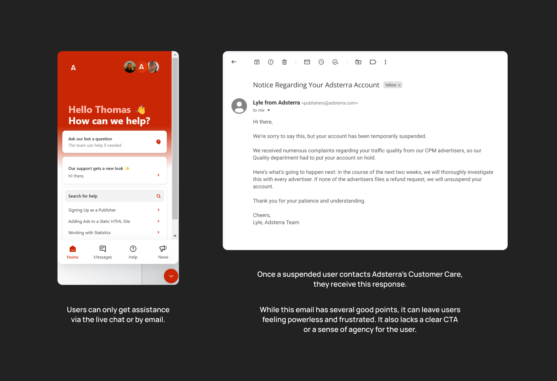
➼ Less-than-optimal user experience: Previously, users had to contact support via email or live chat to initiate an appeal, leading to long wait times and frustration.
➼ Lack of clarity: Users were often unclear about the specific reasons for their suspension.
➼ Limited empathy: The process felt a bit cold and did little to acknowledge user frustration.
➼ No guidance on next steps: Users were unsure how to initiate an appeal or what information was required.
➼ Inefficient information gathering: Adsterra lacked a streamlined method for collecting necessary details for appeal reviews.
This project aimed to make the process easier by creating a dedicated appeal form.
I created this diagram to show typical reasons for account suspension and the previous recovery process. It relied heavily on contacting support, resulting in long wait times and user frustration.
Assesing the Existing Process
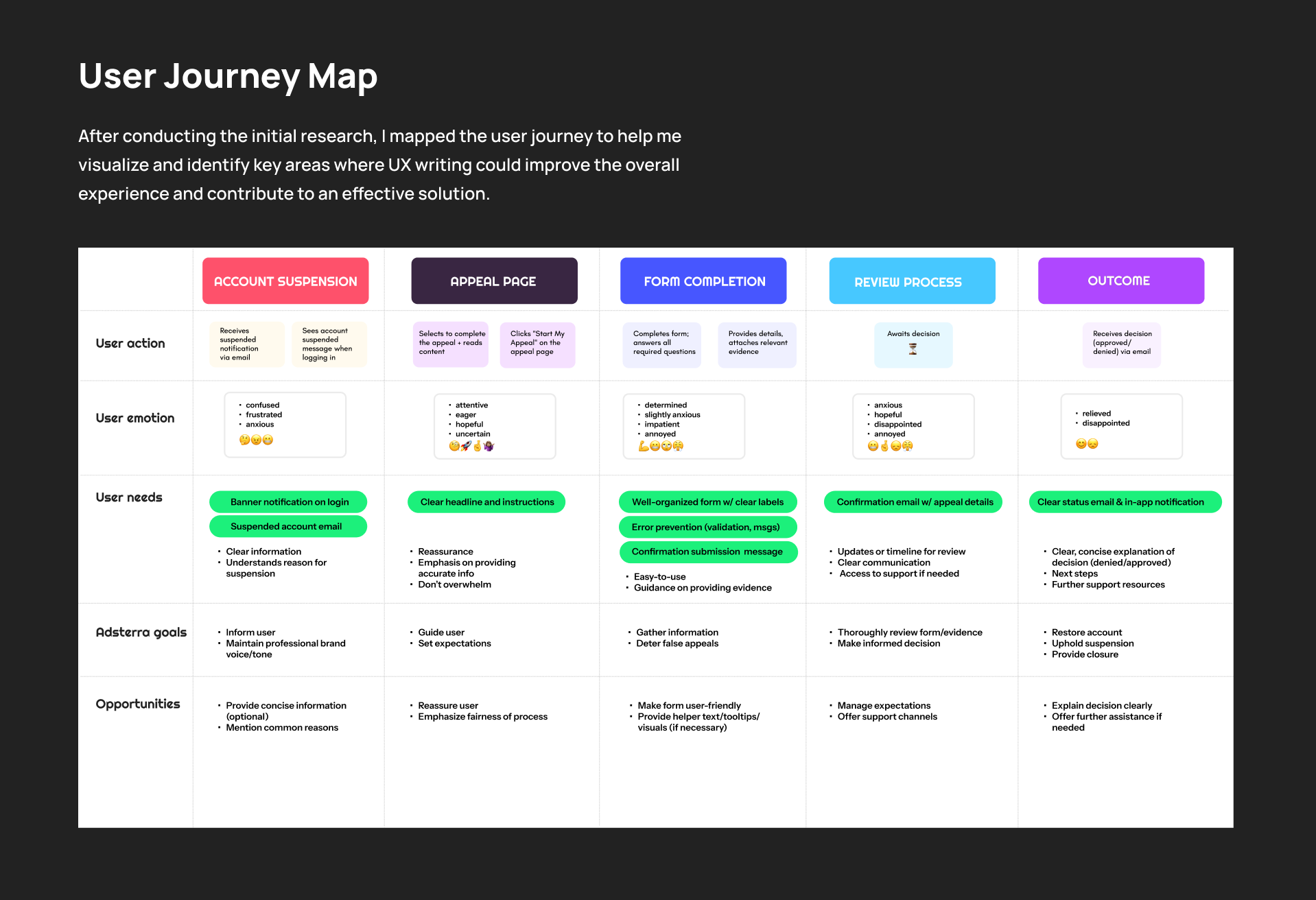
Understanding Needs
The Fix
To remedy these challenges, I worked with the key stakeholders to develop a user-centered appeal process with the following key components:
✔ Updated Account Status Message
The account status message on the login page was revised to provide a more informative experience, clearly communicating the situation and guiding users towards the appeal process.
✔ Clear and Concise Appeal Page
The starting page features a straightforward headline, concise instructions, and a prominent call-to-action button, guiding users seamlessly toward the appeal form.
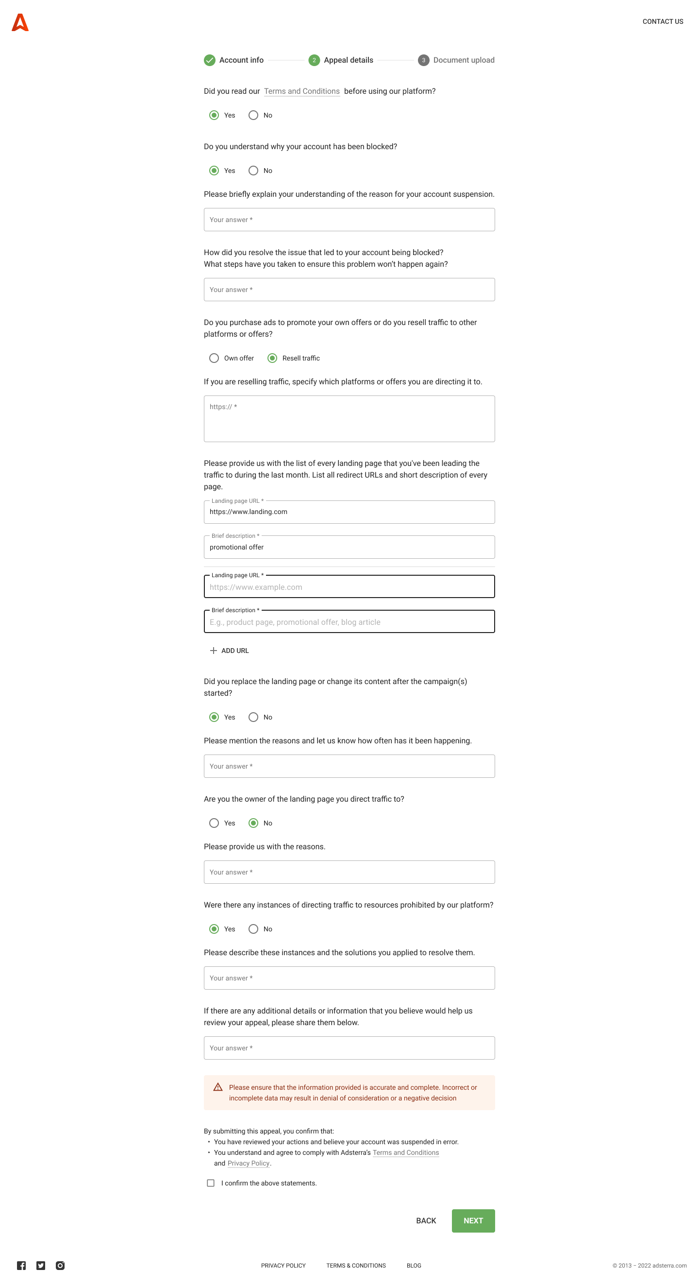
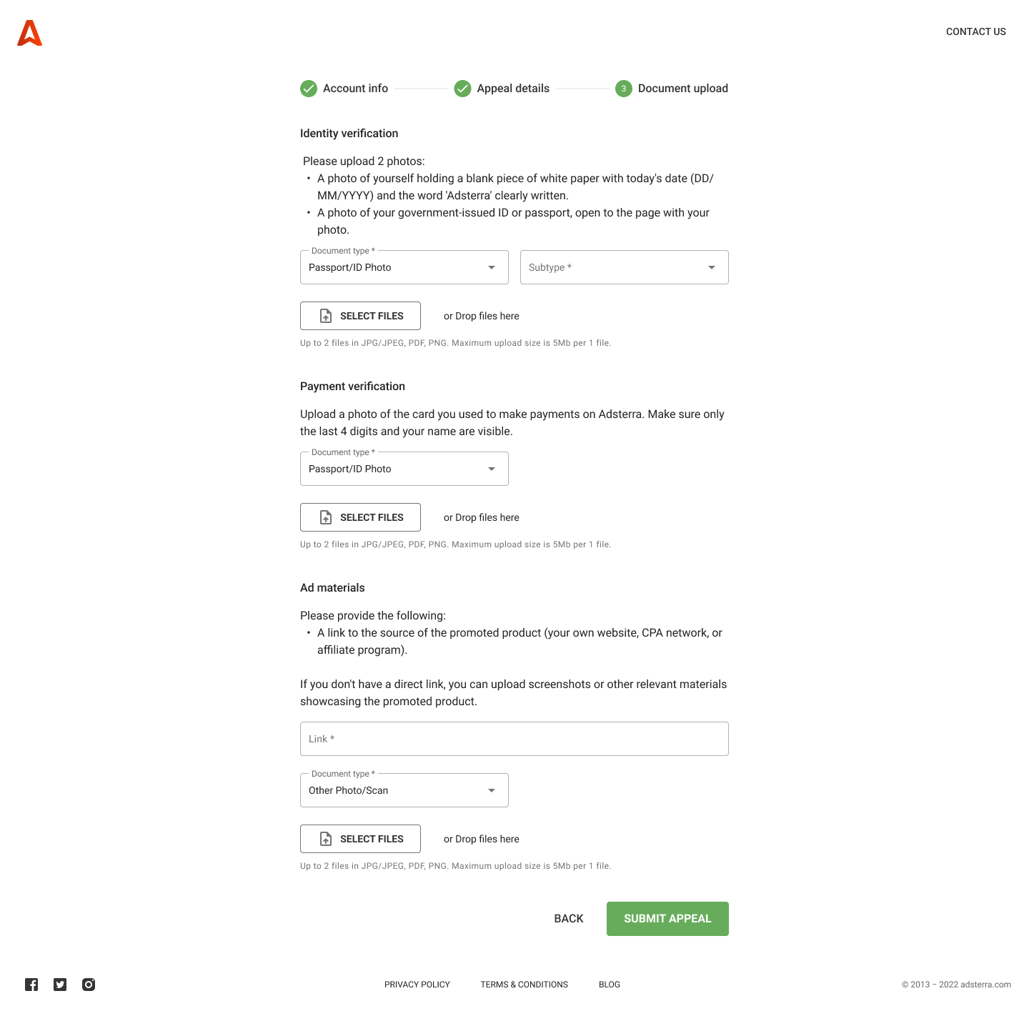
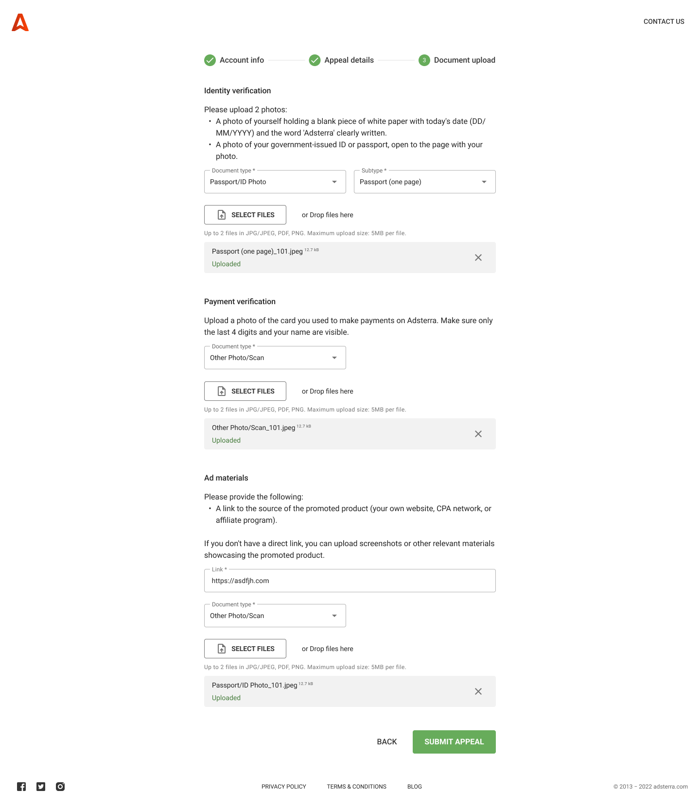
✔ User-Friendly Appeal Form
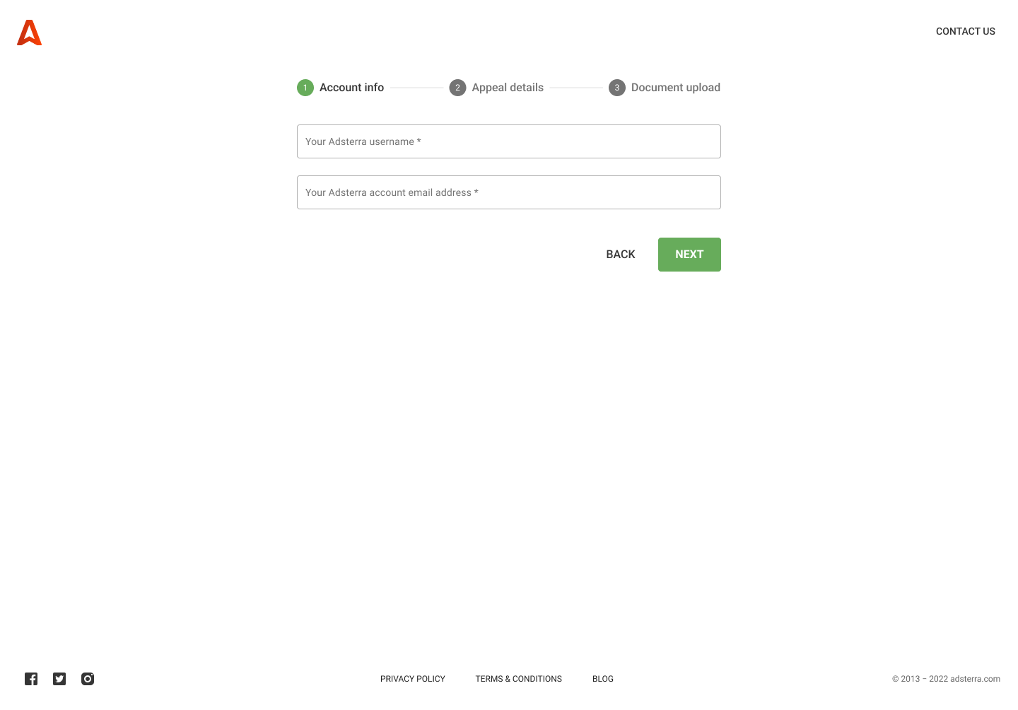
The form was divided into 3 parts (Account info, Appeal details, and Document upload) to reduce cognitive load. The resulting 3-step form is well-organized with clear labels, helper text, and error prevention measures to guide users through the process and minimize errors.
✔ Improved Communication
The process later included a confirmation email, an estimated timeline, and readily available access to support, keeping users informed and managing expectations throughout the appeal process.
Before
⚡️🤷🏽♀️ Email/Chat → 😟 Wait → ❓ Unclear Outcome
Users faced an uncertain process involving emails or live chats, leading to delays and frustration.
After
✏️🤔 Appeal Form → 🤞 Submit → 😊🤝 Confirmation
A straightforward appeal form simplifies the experience, enabling users to take immediate action with clear guidance. It also collects information needed for Adsterra’s review process.
Results
The redesigned appeal process, including the new appeal form with optimized UX writing, led to significant improvements:
✦ High completion rate: The new appeal form achieved an 84% completion rate within the first month, indicating that users found it easy to understand and use.
✦ Reduced support inquiries: Support inquiries related to account suspensions decreased by 12%, suggesting that the clearer information and streamlined process reduced user confusion and the need for support intervention.
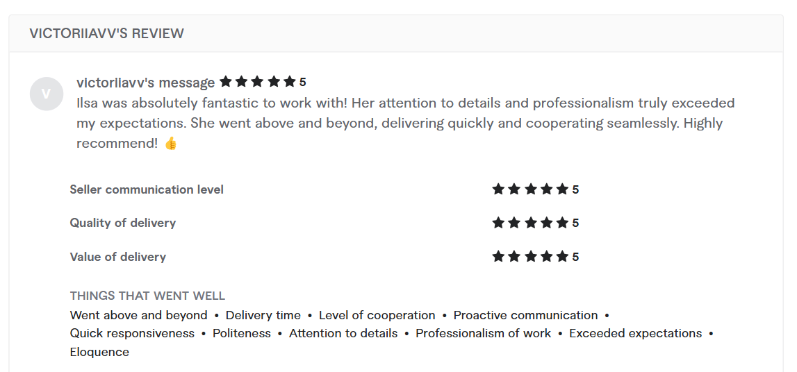
✦ Positive feedback: The revised appeal process received positive feedback from key stakeholders, including a 5-star review for my work highlighting the "clear and helpful language" and the "easy-to-follow instructions."
✦ Repeat business: Adsterra continues to partner with my UX writing services for additional projects, including redesigning other UX/UI content, restructuring flow, and creating help center content.
These positive results demonstrate the effectiveness of the UX writing in guiding users through the appeal process, improving their experience, and achieving Adsterra's business goals. The positive feedback and repeat business further validate the value and impact of my contributions.
Reflection
This project allowed me to apply my UX writing skills to a high-friction process and turn it into a user-centered solution that addressed both user needs and business goals. By considering the project’s multiple needs, we worked together to simplify the appeal process and help improve the overall experience while also making it more efficient for Adsterra.
Going forward, I’d like to explore:
Gathering more user feedback through interviews or surveys.
Tracking long-term impact on metrics like form completion rates and user satisfaction.
Investigating user satisfaction in more detail, such as fairness and clarity of communication, through reviews, sentiment analysis, or A/B tests.


