Invoice Home
Landing page redesign and content writing for a billing and invoicing app.
Scroll ↓
Invoice Home wanted to update its main landing page and needed a more brand-centric experience for new and returning users that left a positive first experience.
Landing page copy and redesign
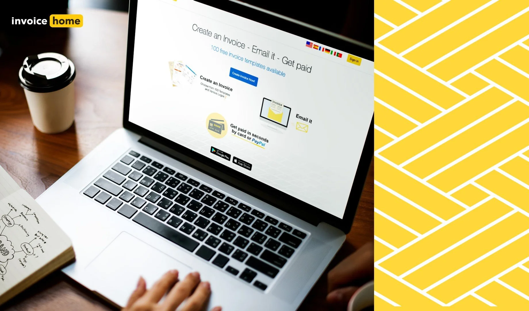
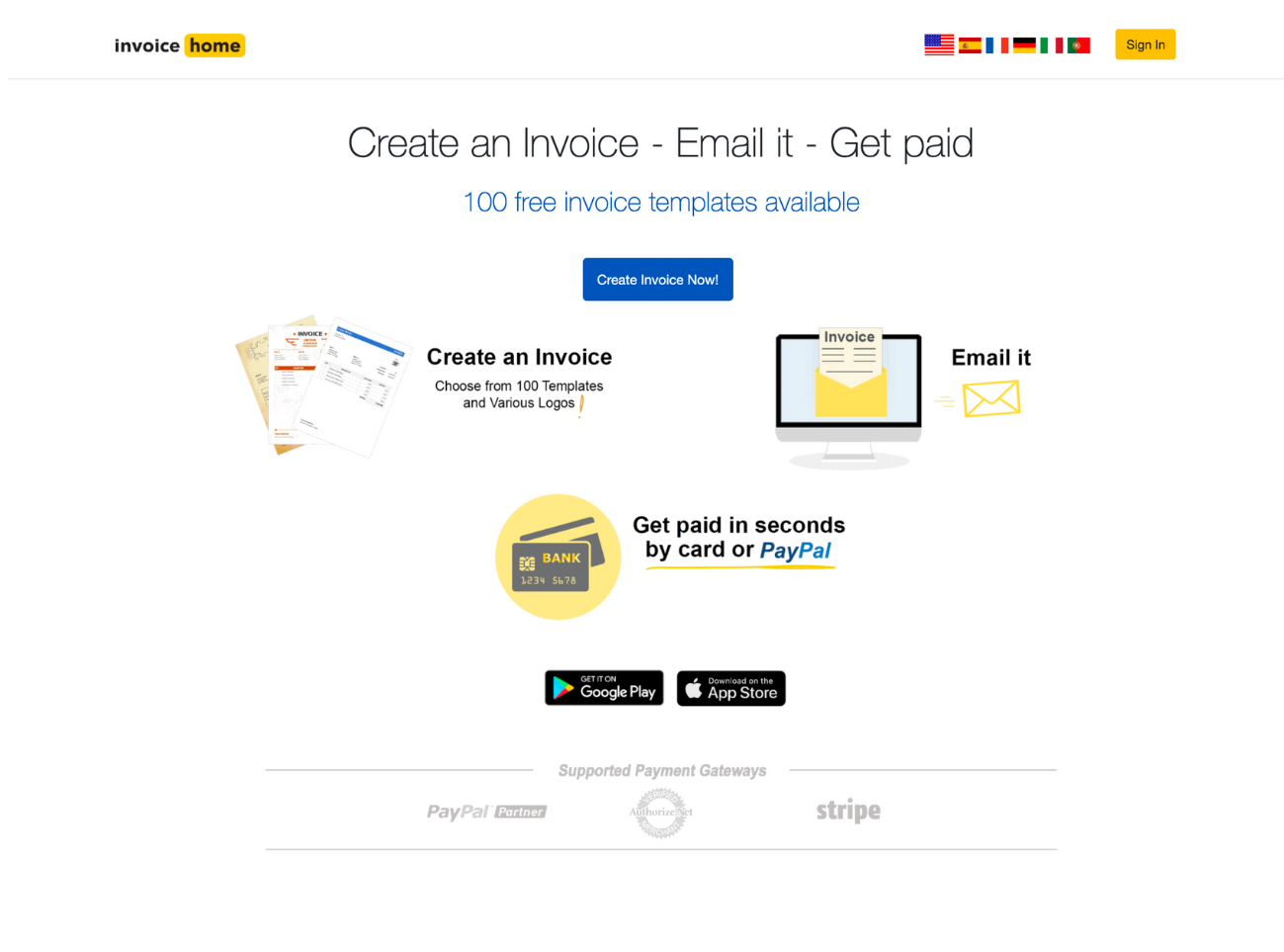
The original version had a lot going on visually and didn't have a clear focus. It was also lacking a compelling header/tagline and a USP. The company is known for its large selection of professionally designed invoice templates, but these were not showcased in the original.
Before
After
Challenge
Update the primary landing page/homepage and incorporate the recently developed brand guidelines so first encounters with the website are more positive, user-friendly, and easier on the eyes.
Solution
Develop a catchy headline, header, and a CTA to hook users and place items in a way that clearly explains what Invoice Home is about and how users can get started.
How I helped
Researched several of Invoice Home’s top competitors and other SaaS websites and made notes of common patterns for inspiration i.e. layout, messaging, and design
Collaborated with the lead designer, marketers, and CEO to reduce the clutter and organize things in a more coherent way; also, several iterations and feedback
Included a navigation menu because it allows users to find the information they're looking for as quickly as possible, increasing ease of use, transparency, and enjoyability.
Removed “100 free invoice templates available” because it often confused users who thought they were given 100 free invoices before being prompted to upgrade
Collaborated with the designers and developers to implement and test versions
Used Google Optimize to A/B test the main “invoice template” landing page.
Process
Researched features page trends and best practices —> Wrote new copy —> Worked with designers to create assets —> Worked with developers to implement the A/B test
Results
The revised version outperformed the original landing page and increased conversions by 23%.
By the time I left the company, it was still waiting to be implemented.
My role
UX writer, junior designer


